UICollectionView layouts on wide iPhones
08 Jan 2015
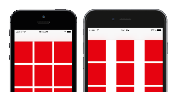
It's not uncommon to use a UICollectionView to show a grid of items in a view and use Interface Builder to configure it's to fit a particular phone width. Unfortunately we no longer have a single phone width to worry about and if we use this static layout on a wider iPhone such as an iPhone 6, the standard behaviour of a UICollectionViewFlowLayout is to increase the spacing between the cells. What is often prefferable is for the collection view's cell size to grow, leaving the gap the same across different device sizes.

The solution
We can use a simple custom UICollectionViewFlowLayout to solve this problem. In our layout subclass we override the prepareLayout method to calculate a new itemSize that best fits the collection view's width.
class CustomLayout: UICollectionViewFlowLayout {


    var numberOfItemsPerRow: Int = 3 {
        didSet {
            invalidateLayout()
        }
    }


    override func prepareLayout() {
        super.prepareLayout()

        if let collectionView = self.collectionView {
            var newItemSize = itemSize

            // Always use an item count of at least 1
            let itemsPerRow = CGFloat(max(numberOfItemsPerRow, 1))

            // Calculate the sum of the spacing between cells
            let totalSpacing = minimumInteritemSpacing * (itemsPerRow - 1.0)

            // Calculate how wide items should be
            newItemSize.width = (collectionView.bounds.size.width - totalSpacing) / itemsPerRow

            // Use the aspect ratio of the current item size to determine how tall the items should be
            if itemSize.height > 0 {
                let itemAspectRatio = itemSize.width / itemSize.height
                newItemSize.height = newItemSize.width / itemAspectRatio
            }

            // Set the new item size
            itemSize = newItemSize
        }
    }
}
As an added bonus, you could easily extend this layout to support a different number of items per row based on its orientation. You could even add more items per row if the item size becomes too large.
A sample Xcode project is available on GitHub.